

A clean, animated credit card UI built with no JavaScript. Just creativity and the power of modern CSS.
🧠 Why I Built It
Today’s user interfaces are leaning toward glassmorphism, floating elements, and smooth animations. Inspired by these trends, I challenged myself to design a sleek credit card UI with only HTML and CSS.
This design is perfect for:
- Showcasing in your portfolio
- Prototyping fintech concepts
- Practicing advanced CSS skills
- Creating unique UI/UX elements
Best of all, no JavaScript is required!
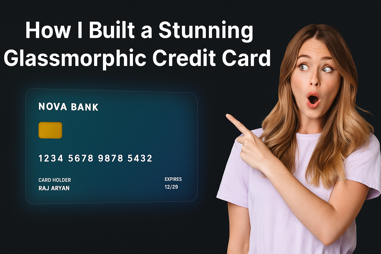
✨ Demo Preview
Here’s what it looks like:
🔗 GitHub Repository – View Code
🔑 Key Features
Before we look at the code, let’s see what this UI includes:
- Glassmorphism background
- Neon border glow
- Floating animation
- 3D hover effect
- Gradient chip design
- Fully responsive layout
🧱 Basic HTML Structure
First, let’s look at the HTML layout. It’s simple and well-structured.
<div class="card">
  <div class="card-logo">NOVA BANK</div>
  <div class="card-chip"></div>
  <div class="card-number">1234 5678 9876 5432</div>
  <div class="card-details">
    <div>
      <div class="label">CARD HOLDER</div>
      <div class="value">RAJ ARYAN</div>
    </div>
    <div>
      <div class="label">EXPIRES</div>
      <div class="value">12/29</div>
    </div>
  </div>
</div>
🎨 CSS Effects Explained
Let’s break down the key styles and how they work.
1. Glassmorphic Background
To create the blur and transparency:
cssCopyEdit.card {
  background: rgba(255, 255, 255, 0.1);
  backdrop-filter: blur(16px);
  -webkit-backdrop-filter: blur(16px);
  border-radius: 20px;
}
This gives a frosted-glass look. It’s a common glassmorphism technique.
2. Floating and Hover Animation
This animation adds subtle motion, making the card feel alive.
cssCopyEdit@keyframes floatCard {
  0%, 100% { transform: translateY(0); }
  50% { transform: translateY(-10px); }
}

.card {
  animation: floatCard 6s ease-in-out infinite;
}

.card:hover {
  transform: rotateY(10deg) rotateX(5deg) scale(1.03);
}
When you hover, the card slightly rotates and scales up. It creates a 3D illusion.
3. Glowing Border
A soft animated glow adds polish and visual appeal.
cssCopyEdit.card::before {
  content: "";
  position: absolute;
  inset: -2px;
  background: linear-gradient(135deg, #00ffe7, #0075ff);
  filter: blur(20px);
  opacity: 0.3;
  animation: glow 4s ease-in-out infinite alternate;
}
This glowing border effect pulses slowly, drawing attention.
🧪 Try It Yourself
The full project is available on GitHub. You can explore it, fork it, and even customize the design.
Tip: You can change the background color, card brand, or layout to match your personal style.
🌐 Where to Use This Design
This component works great in various places:
- Your personal portfolio
- A payment UI demo
- Design showcases
- Fintech prototypes
- Frontend animation practice
If you’re applying for a job or freelance role, showing this in your portfolio can leave a great impression.
🎯 Final Thoughts
With modern CSS, you don’t need complex JavaScript libraries to build beautiful animations. This floating glassmorphic credit card is a great example.
It teaches you how to:
- Use
backdrop-filterfor glass effects - Animate elements with keyframes
- Create responsive, modern UI blocks
- Build interactive experiences with just CSS
If you enjoyed this tutorial, feel free to star the repo or share it with your network!
📌 Follow ViralNook for more creative front-end tutorials, UI design tips, and real-world web projects.
Have feedback or your own version? Share it with us — we’d love to feature it!


Leave a Reply